Compositional Guidelines for Better Photography
There are many visual tools in your artist’s toolbox which help create more striking visual narrative. One such toolset includes so called “compositional rules.”
Now, as I am not one for adhering to the rules, I prefer the verbiage ‘guidelines’ instead. So, that’s what we’re going to use from here on out.
By having a solid handle on these guidelines, we can prepare ourselves for whatever scenario we find ourselves in. As a documentary travel photographer, I often find myself in unfamiliar locations with little prep time. Of course I can (and do) research on potential photographic opportunities before arriving, but one cannot simply anticipate every thing - especially if one hopes to put their own unique voice into a travel photograph. With that in mind, having a mental lockbox of compositional guidelines to fall back on allows one to look at a location differently and with intention - and as all of my photography students can attest to, in my book, intention is everything.
Before we get to the guidelines, I want to explain how we will approach analyzing the example images. I’m going to talk a lot about “The Eye” and it’s movements. When you look at an image, try and pay attention to the route your eye takes while viewing. My grandma the talented painter once said to child-me, “the goal of a painter is to make The Eye go on a circular journey, never allowing it to leave.” That’s what you want in your photographs. You want The Eye to be free to move about the cabin frame in with ease.*
*Note: I am not one to speak in absolutes. There are times the artistic vision is to make a viewer feel cramped, frantic, uneasy, claustrophobic, etc. Knowing compositional guidelines, and when to not follow them will help in these situations.
I am also going to challenge you to rethink how you look at a scene. What I mean by that, is to not look at a landscape and see a grassy hill and tree. Instead, you should be seeing curves (the hill), strong lines (the tree and branches), softness (the grass on the hill), sharpness (the leaves on the tree). An easy way to get in to the habit of seeing differently in a scene is to unfocus you eyes (bonus points if all you have to do is remove your glasses) and just take note of the shapes and textures you’re seeing.
With all that out of the way, let’s have a look at some common and master-able compositional guidelines.
Rule (coughguidelinecough) of Thirds
Probably the most oft muttered of the compositional guidelines. So oft that I considered leaving it off this list all together. But, as it is the first rule most new photographers get a handle on, it seems unjust to ignore. Just please note that it is not absolutely necessary to *always* follow this guideline. There are absolutely endless opportunities where it is not necessary. Okay, off the soapbox.
Here it is: Imagine the frame divided into nine equal segments (this grid is often a feature you can turn on your camera LCD/EVF). By placing the most important elements/subject where the lines intersect, you are creating an arguably more interesting image. The important thing to note here is that not only are you showing intent by not plopping that coffee cup in smack dab in the middle of the frame, but you are also allowing for space for *context*. I approach the Rule of Thirds as a gateway guideline which allows for others to come in to play. More on that later.

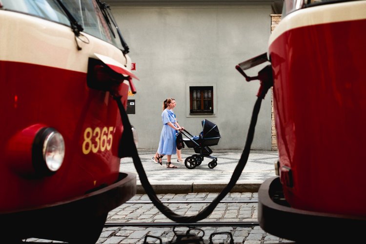
Placing the subject (the couple) to the right of center in the frame allows for visual space showing the path of which they are walking.
Leading Lines
Our eye naturally is attracted to lines, and instinctually follows them. You can use this to your advantage by placing a subject at the end point of a line. Some commonly used leading line are streets, fences, bridges, etc. I would urge you not to fall into the trap of using railroads to create a leading line as its both extremely dangerous and most often illegal.
Instead of falling into that trope, look for some less-obvious leading lines.
One commonly seen utilization of leading lines is a technique known as “single-point perspective.” In single point perspective the leading lines converge on a single vanishing point in the distance. If you’ve seen any Kubrick film, you will recognize this technique. It’s a great tool to give a sense of continuation of a scene.

Here the handrail works as a line leading The Eye to the subject.

An example of single point perspective. The streets and awnings of the buildings create four distinct lines converging on the center of the frame, allowing for the subject to be positioned dead center.
Framing
Another commonly talked about guideline, but one with some real heft behind it. Essentially you are wanting to create a frame within the frame which highlights the subject, making it clear at what the viewer should be looking. There are plenty of found frames which can be used, such as er- door frames, mirrors in frames, window frames - seeing a pattern here? But guess what, it doesn’t stop there!
Be creative and make the frames. I for one use a lot of body parts - people pointing, shoulders, profiles, etc. My living room window sits eye-line with a tram lines and I cannot express how many times the bars connecting the tram to the wire have been used as a frame in my images.
Having trouble finding some of these lesser-seen frames? Go back to the unfocused eye trick. Are you seeing any strong lines filling the scene? Those are what you’re looking for - now just try and find a subject to which they can enhance and draw The Eye.
Using the trams and their connecting wire to frame the women and pram gives The Eye an obvious focal point. Here even the window above the pram adds to the framing.
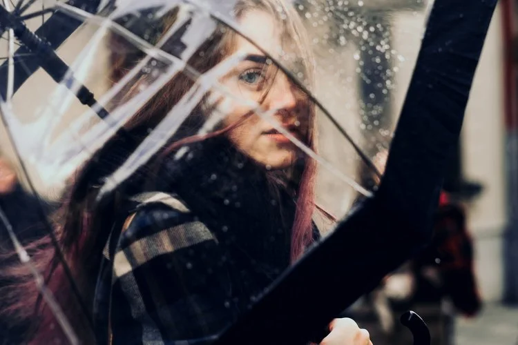
This frame may be less obvious as it’s three different elements. The wire from the umbrella, a long reflection on the umbrella, and the subject’s hair create a pleasing frame around her eye. This lets The Eye know what is most important, even while the subject’s eye may not be the crispest element in frame.
Scale
Scale is simply showing the viewer how large something is (or isn’t). By using an element which everyone knows the size of, you can show the viewer the immensity or puniness of an element. Common usages may be a person being completely dwarfed by a large building, thereby showing that building is impressively large. You can play this the other way, as well.
Looking at the image below, you’ll see the iconic Eiffel Tower. Everyone in the modern world has some conception of how large the tower is, but by making it tiny in the image, we’re now getting a sense of the sprawl of the city.
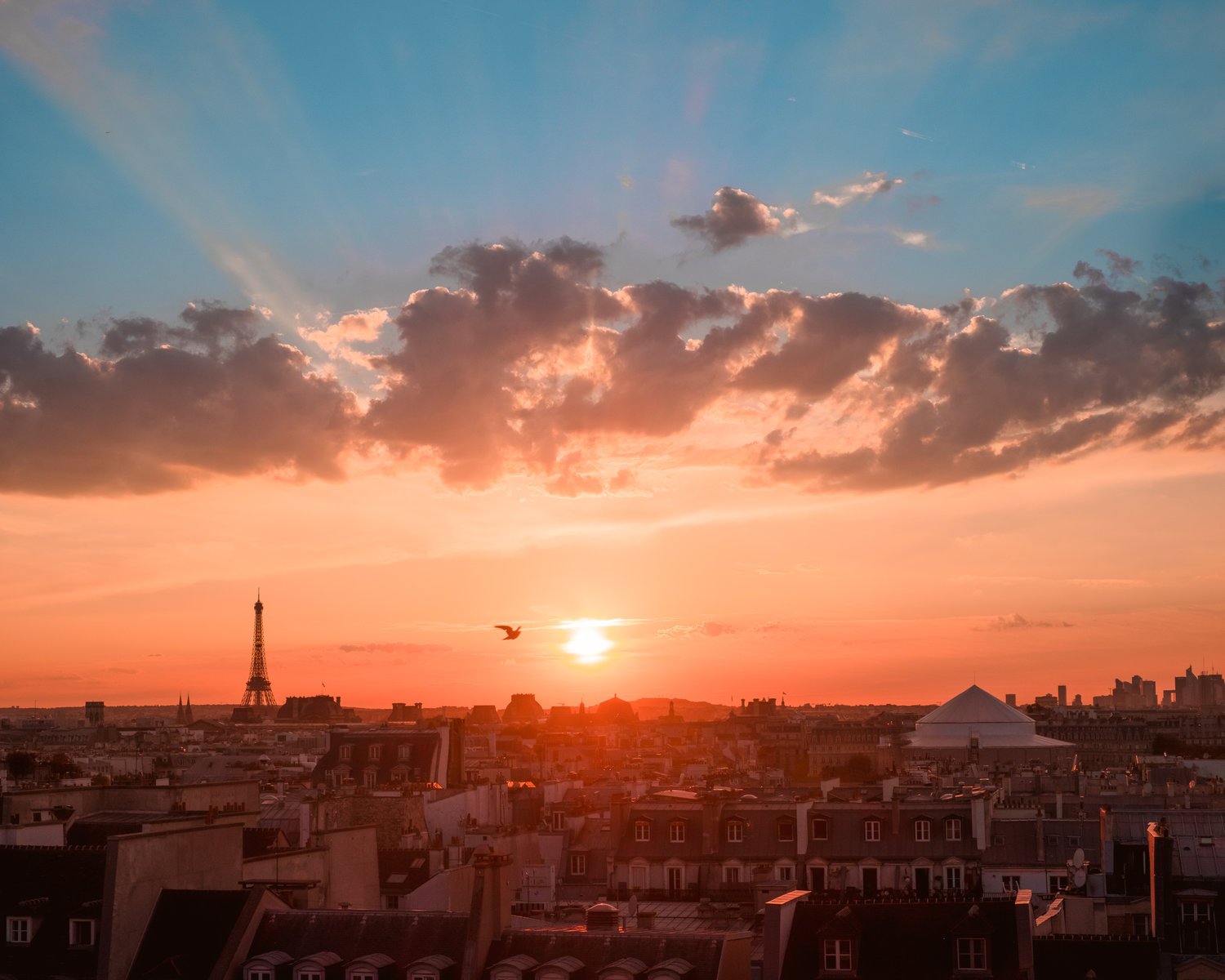
As noted above, the Eiffel Tower is our note of scale in this image. You can also play with the depth by including elements which play off the scale of the telling element. For example, here our brains can easily understand that the bird must be relatively close to the camera because of its size against the Tower.
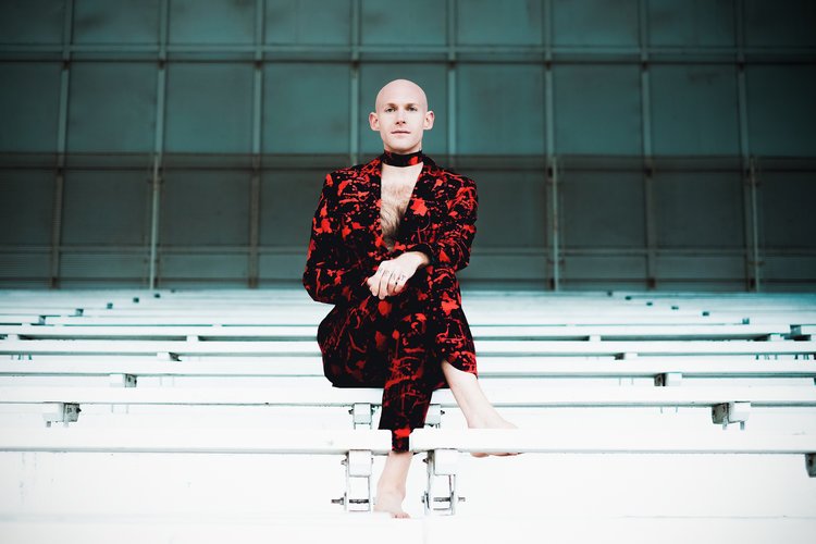
Rule of Odds
When The Eye looks at an image with an even number of elements, it bounces between them, with the frantic ping ponging of a tennis match, not knowing where to rest. Having an odd number of elements give The Eye some time as it moves from element to element.
When the brain processes even numbered elements, it tends to couple them up, which in turn splits the image. But, with an odd number it creates a connecting element and maintains the singularity of the frame. Please note that the word “element” here doesn’t necessarily mean a single object - sometimes an element can be a grouping. For example, a bouquet of flowers, a couple sitting together, a bottle of wine with a glass in tow, etcetc. For added compositional zen, when framing these elements do decide which is the primary subject, and balance the others off of it by making one physically larger than the other or playing with the depth of field.
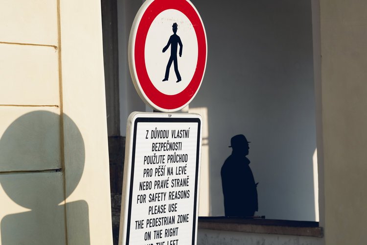
The figure, sign, and shadow are our three elements. Note how The Eye bounces between them in a triangular rotation.

Here our three elements may not be as instantly recognizable, but they are the couple, the basilica and man smoking. Again The Eye makes a triangular motion around the frame.
Repeating Patterns
Patterns come in many forms: lines, colors, shapes, textures, and so on. A strong pattern can be used to guide The Eye to the subject of the image. It can also make a solid object stand out and pop by breaking the pattern. Imagine a top down photo of a crosswalk (zebra crossing to the Brits reading this). We’ve got a strong pattern in the painted white lines. Now, imagine a person with a bright yellow umbrella walking across it. That solid yellow is amplified by the repeating nature of the crosswalk.
Patterns can be found everywhere. Yes, there’s the obvious crosswalk example, but challenge yourself to find patterns in less obvious places. Irregular patterns often appear in nature, like the disrupted sand as it is pushed and pulled from the sea. Regular patterns appear in manmade structures, and even can be found in crowd of people. Filling the frame with a strong pattern almost always creates an interesting shot.
There are two distinct repeating patterns in this scene: the squares in the background, and the lines of the bleachers. These create a a simplistic but interesting backdrop.

The repetition in the glass ceiling creates a stark contrast from the more chaotic mosaic that it leads to.
Balancing Elements
Lack of balance is where many photos following the Rule of Thirds miss out. A photographer spends so much time making sure their subject is in that right quadrant of the photo that they miss the fact that the image is now heavily weighted.
Discussing visual weight can be hard to articulate, but when we are aware of it, it becomes extremely noticeable. Here’s another time when the unfocusing of eyes really comes in handy. Unfocus on a scene, does it just *feel* heavy on one side? You’re going to need a lesser-element to counterweight the subject element. That balancing element should be obviously of lesser-import either by making it smaller or more out of focus than the subject. An intentional balancing element can also create more context in a scene.
If we think back to that coffee cup in the Rule of Thirds segment, what could be used to both balance it and create context? Maybe an open book on a cafe table? Maybe a bag of coffee beans? Anything which tells the viewer where they are and fills in the unweighted space of the frame.

You may have to look closely at this one. We have the obvious subject of the woman’s reflection, but looking to the left, you can see an opaque figure of a man looking in her direction. That figure adds a much needed balance, and without it the woman figure would feel cramped and weighted to the left.

Here the addition of a bateau fills in the right part of the frame. In addition to needed balance, it also adds location context.
Depth
The part of view that is closest to an observer is the foreground. The background is what’s furthest away from the observer. What’s in between is the mid-ground. Okay with that vocabulary out of the way, we can talk about depth.
By showcasing multiple layers in a frame, a photographer can give a sense of breath of a location. If there’s no specific foreground of a scene, you can create one. My go to is my lovely obliging husband’s profile. Be creative and try different angles to get solid differential fore, mid, and backgrounds. When doing this, you should make a choice as to where you’re placing your subject and make depth of field choices based around that.
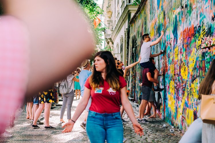
The intent of this image was to show the chaos of the John Lennon Wall in Prague, but also bring attention to the men in the back. But creating a foreground with the man’s elbow, and a mid-ground with the woman in read, The Eye is slowly drawn to the men at the wall while giving the viewer a sense of crowding.

In this image the fore, mid, and backgrounds are all achieved by using human subjects. They are also all similarly in focus, so it’s the size of the figures which gives off the sense of depth.
Perspective/Viewpoint
Here’s something I tell all my photography students: what you see is completely unique to you. Your viewpoint is just that, *your viewpoint*. Use that to your advantage and showcase how you see the world. For me, I am not a tall woman, so I see the world from behind shoulders and from low angles. I can enhance that by positioning myself in a way which adds visual interest to a subject.
Get low, get high, find unique angles. Anything which isn’t the normal eye-height straight on will create a more dynamic image. You can add little hints of recognizable detail to help the viewer understand where you are while still showcasing something new about a recognizable scene.
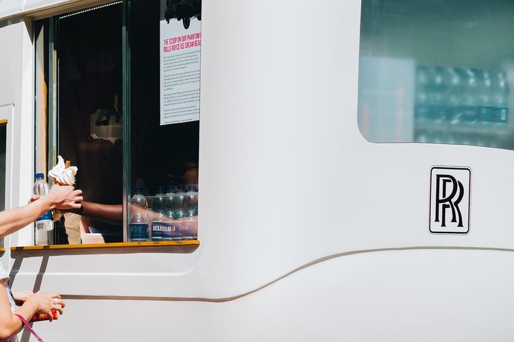
Taken from the side of a Rolls Royce ice cream truck, the intent of this shot was to showcase summer nostalgia. By shooting from an abnormal angle, the image has added layer of interest and anonymize the figures.

There’s actually a few different guidelines happening here, but what I’d like to drive home with it is to show what you see. As mentioned, I am often seeing the world through people’s shoulders, and that is doubly so for famous sights like the changing of the guards in Athens.
Nose and Headroom
This guideline is snagged from my former life as a filmmaker, but it’s one that holds just as much importance in photography. When photographing a subject, you want to leave enough breathing room. This goes for living subjects as well as inanimate.
If you’re photographing a person and they’re turned to the right of the frame, unless your intent is to make your viewer to feel claustrophobic, you should leave some space between the nose of the subject and the edge of the frame. Same goes for headroom. Leave a little room between the top of the subject to the top of the frame.
Now, of course there are times where this can be ignored, such as cutting the top of the head of a model in a headshot, but in general watch where you cut the frame. A good practice is to look at every corner and all edges of the frame while composing. Pay close attention to what’s being cut off. Be intentional with your framing choice.

As the model is facing slightly to the left, I made sure to leave enough room to the left of the frame. This gives the subject room to breathe and creates a feeling of ease in the viewer.
Fill the Frame
If you’re unsure of how to effectively capture a scene, it may be because there are many distracting elements or unnecessary empty bits. Try filling the frame with your intended subject. This isolates the subject and makes it very obvious to the viewer. Don’t be afraid to get really close, either. Be completely unapologetic about your attempt to fill the frame. Combine this technique with patterns for a really dynamic shot.

There was a lot happening in this scene of an outdoor laundromat. Instead of confusing the viewer by trying to introduce multiple elements into one frame, this image focuses in and fills the frame with one spot of the scene. The Eye bounces frantically around the frame to illustrate the pandemonium of the location.

Filling the frame showcases details very effectively. Here we’re seeing just a part of a motorcycle. While we cannot see the entire bike, we get an idea of its appearance as well as an appreciation for all the intricate work that goes into it.
Negative Space
On the opposite end of the spectrum, we have negative space. This is where my mantra of be intentional really gets reinforced. There are absolutely times when what seems like unnecessary empty space is ideal for the photograph you’re attempting. Negative space can elicit a feeling of solitude, vastness, calm, etc.
When trying out negative space think about where you are placing the subject very carefully. Do you want to highlight the surroundings? Maybe placing the subject off-center within the rule of thirds is the way to go. Are you more interested in showcasing the emptiness around a subject? Try a more center-weighted composition. When done properly, negative space is an incredibly useful tool for showing atmosphere.
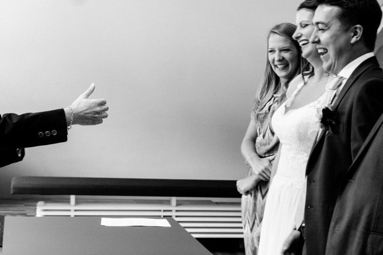
Here the negative space to the left of the frame shows the relationship between a bridal party and officiant. The negative space is broken up with a minimalistic singular thumbs up.

One really effective usage of negative space is to show solitude. Here the man is dwarfed by the empty spaces to all sides of him. Despite being taken at the busy Taj Mahal, the emptiness makes the environment feel calm.
Golden Triangles
Alright, you’re going to have to stay with me here a little, because this one might not click straight away. We’re going to go back to the rule of thirds for a moment. Remember how we cut the frame into nine rectangles. Well with golden triangles we cut the frame into diagonals and place elements accordingly. This creates something known as dynamic tension.
Essentially dynamic tension makes the viewer feel, well, tense. We’re not accustomed to strong diagonals in every day life. We see things on a flat plane, more or less. But, by introducing diagonals, we’re showing a scene in an unfamiliar way. Think of it this way: straight lines = stable, diagonals = rickety.
So how do we do it? Cut the frame into four triangles of two different sizes by drawing a diagonal line from one corner to the opposite, and then two lines off of the remaining two corners, reaching the first line at a 90 degree angle. Phew. You then want to place your elements within the triangles, or place diagonal elements running along the two lines. Still with me? Maybe let’s just look at some examples.

Note how the elements (the couple, the statues, the tower) are placed within the triangles.
Golden Ratio
Math time! Nah, who am I kidding, I’m not going to subject you to my terrible understanding of geometric formulae. Let’s ELI5 this one: Larger elements lead to smaller subject elements in a spiral. Imagine a snail’s shell or one of those really trendy spiral succulents you see all over instagram. The spiral starts with large bits and spirals down until the smallest bit. Basically The Eye is being lead to the center without you even noticing.
That’s what you’re trying to do with the Golden Ratio - use larger elements to sneakily guide The Eye to the smaller subject. That’s really the crux of it. Save the complicated algorithms to Euclid.

Notice how The Eye travels from the baby, around the back of the bride, down the arms and back to the baby’s face. This circular motion is caused by the larger elements guiding The Eye to the subject (the baby).
Break the Rules
Once you have a good understanding of the guidelines, it is best to use them when appropriate. But, here’s the rub, you’re an artist and as an artist you need to express your creative vision. That might mean ripping the pages out of your text book Michael Scott style and throwing all the rules away. And that’s fine - more than fine, actually. Once you have a grasp of the guidelines you will understand when they benefit your final image and when you can tweak them to fit your needs. So get out there and practice practice practice so you can break break break!

The lack of depth here makes the image almost look like a film set. The groupings of people also break the rule of odds, however it comes together as a successful image.

There’s a lot happening here - an out of focus hand dead center, a cut off row of buildings, and large splotch of color in the lower left quadrant. These broken rules help tell the story of a bus tour trip from the viewpoint of the traveller.
This is a repost of a post from Chelsea London. See the original post (with more examples) here.