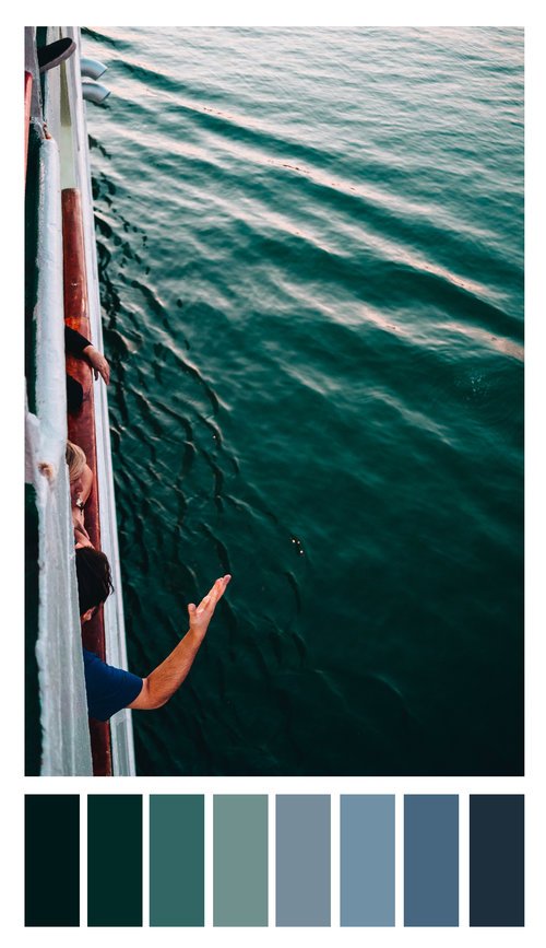
How is color theory being used in this image?let's see this in practice
So now we know the orders and variables, as well as three popular schemes of color, but how do those tools aide us in our photography? When we combine the three aspects we discussed above, we can deliberately look for or create scenes that further our intended story.
Note Figure 6a below. When I first approached this scene, I saw two things, interesting lines and complementary colors. With a little patience and a whole lot of luck, the jogger ran into the scene wearing one of the two complementary colors. Had this color story not been introduced, the image would have had much less impact. In this instance, the color creates the story.
Figure 6b utilizes monochrome in secondary colors. With a stark gradient from dark to light oranges, the image projects a warm summer's sunset - which is exactly what I was hoping to acheive as it was well over 105F (42C) - and trying to capture that in a photo was an important part of the story of my time in that city.
Finally, in Figure 6c we see analogous tertiary colors. While the color is not so much the subject as it is in the other two, it is still crucial to set the mood for the shot. The various levels of greens and blues in the ocean water enhances the relaxed atmosphere I was intending to create with this image.
Figure 6a: Complementary secondary colors.Figure 6b: Monochrome secondary colors.Figure 6c: Analogous tertiary colors.With great power comes great responsibility. or something.
To recap, we went over are three orders of colors (primary, secondary, and tertiary), three variables of color (hue, saturation, and luminance), and three popular color schemes (complementary, analogous, and monochrome). When you have a good grasp of these basic aspects of color theory, you're off to a good start and can work to manipulate a scene to create the desired ambiance or ~vibe~ in your shots.
Disclaimer: It is important to note that while RYB color is one with which we are all familiar, it is not the standard anymore. In fact, your photography software does not utilize RYB color by default. It uses a different, four color, subtractive color model known as "CMYK" (cyan, magenta, yellow, and key black). We stuck with RGB to keep it simple. In a future lesson, we will go deeper into color theory, as it is a rabbit hole. (Relevant xkcd is relevant).
In the meanwhile, an excellent resource for the choosing colors is Adobe's color wheel. Here you can chose a color wheel and scheme and be given applicable pairings of colors. If not for nothing, it's a fun and pretty to look at - try it out!


