Unit Six : The Art of Photography
Orange and blue are complementary colors.
When you decorate a house, you choose the color of the walls to go with the furniture, wall hangings, curtains, and so on. You're essentially creating a color scheme. We do the same thing when we set up a shot. When being intentional with the color in your images, scheme absolutely comes into play. Three of the most popular color schemes are complimentary, analogous, and monochrome. To look at each individually, it will help to revisit our RYB color wheel.

Figure 3: Complementary color wheel

Figure 3a: Tones of blues and yellows complement each other.Figure 4: Analogous color wheel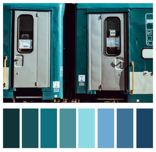


Figure 4a: Varying shades of blue and green are analogous.Figure 3b: Greens are reds are complementary.
Figure 4b: Browns and oranges sit next to each other on the color wheel.
Figure 5: Monochrome color wheel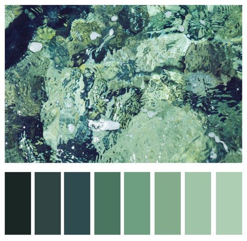
Figure 5a: Shades of greens.Complementary colors
Simply put, complementary colors are the ones which sit completely opposite one another on the color wheel, and they, ahem - complement one another. For example, red and green may make you think of Christmas, or light blue and orange may make you think of the Mets (oh, only me?) But there's a reason these combinations create such strong emotions in us - they just look good together.
Below you will see a few images which utilize complementary colors. Note how our attention is not being fought for by strong colors, but rather the colors create balance.


Analogous colors:
Colors which sit next to each other on the color wheel and share similar colors are known as analogous colors. They will have one dominant color in common, most often a primary color, but can also be a secondary or tertiary. Analogous colors are often found in nature - think those rich oranges and yellows in a New England autumn.
Landscape photographers can really benefit from knowingly utilizing analogous colors, of course, but they also lend themselves to other aspects of photography, such as beautifully bokeh'd backgrounds of a portrait. By having similar colors in the background, the subject remains the focus.
Below you will see some examples of analogous colors.
Monochrome colors:
While you may be familiar with monochrome referring to black and white, it actually refers to anything which uses solely one color value. Those images you see where there is overwhelmingly one color present are monochrome, for all intents and purposes. We see this technique often in those hazy sunrise/set shots, but it is also a very impactful technique for street shots.
Below we see three example images using monochrome colors.
Figure 5b: Shades of orange.Figure 3c: Darker shades of blue complement oranges.
Figure 4c: Analogous shades of blues and purples.
Figure 5c: Shades of pink.